
SLO Transit Redesign
Duration
9 weeks
Tools
Figma, Mobile Prototyping,
Key Skills
Mobile App Prototyping, Project Management
Team
Modernization Team at Cal Poly Iter8
Creating a more modern, yet familiar experience for our local transit system
In this project, I served as one of the Product Managers in a team of seven other students in the student run design club, Cal Poly Iter8. Over the course of 9 weeks, we worked to redesign the San Luis Obispo Transit Mobile Application.
Background Info
SLO Transit is the public transit system for the city of San Luis Obispo, which provides daily fixed-route transit services within the city limits and to our university, Cal Poly SLO. Riders rely on SLO Transit’s many bus routes to work, study, and attend events. However, the current solution to navigate their services — the SLO Transit mobile application — is unguided, inconsistent, and difficult to navigate, which can discourage people to ride the bus and hinders
the county’s efforts to reduce emissions.
We redesigned the SLO Transit mobile application to improve the rider experience and to incorporate new features that both first-time riders and frequent riders would find useful.
The Modernization Team at Cal Poly Iter8

Problem Statement

The SLO Transit users have voiced many concerns with the service’s mobile application. Riders often have trouble knowing which bus to take to get to their destinations, and frequent users speak about the app’s cluttered and inaccessible interface. Since many people rely on this mode of transportation every day, it is crucial that key information is clear and accurate.
How might we develop a better, more sustainable solution that decreases rider confusion and increases ridership?
Research
To empathize with our target audience and those who use SLO Transit, we created a customer journey map, starting with the users (rider, bus driver, technician, and management) and ending with the last interaction the user has with the bus. This helps us understand the step-by-step actions riders take now to reach their destination.

To gain more in-depth insight on our users, we interviewed several people with various relationships to SLO Transit. Our experts included Cal Poly students and faculty, San Luis Obispo residents (non-student), public workers, and a representative from SLO Transit.
From our interviews, we repeatedly encountered a few pain points users encountered when riding the bus. For example, users commonly had trouble understanding when buses arrive and finding which bus lines to use to get to their destinations. First-time and infrequent SLO Transit interviewees also voiced concerns about the current app’s lack of guidance in helping them choose which buses to take. Those insights led us to decide to focus our ideation efforts on the earlier steps on the journey map: planning and deciding on bus routes.

During our interviews, we took key insights from our interviewees and converted them to How Might We notes, or statements that identify opportunities for improvement. These statements helped us create a bank of prompts for the next stage: ideation.
Ideation
After sharing our findings as a group, each team member drew from the must-have features and design elements from our How Might We statements to sketch ideas. We brainstormed in words, then drew sketches, then iterated on each other’s sketches. With all of the ideas dumped, each of us then created 3-panel storyboards showcasing our best solutions.

To improve on the information architecture of SLO Transit’s mobile app, we discussed each group member’s solution sketches, critiqued each solution, and voted on our favorite ideas to determine our key features. A few solutions stood out:
-
A trip overview page that featured clear iconography and a visual of the trip’s “stages” on the left side
-
An onboarding feature showcase to help first-time riders understand key features of the app
-
Including photos of bus stops when viewing a specific stop
(You’ll see these in action later in the page)
Then, we created a user flow to connect all the solution sketches in the order in which a user would engage with our application, and if there were any gaps, we filled them in together with wireframes and illustrations.

Prototyping
After creating our user flow, we prototyped the mid-fidelity wireframes of our application using Figma. In our mid-fidelity prototype, we built out the main features of our app, such as:
-
Incorporating trip planning to assist users in choosing which line to take and which stops to board and depart at.
-
Including a trip overview and step-by-step directions to walk to a given bus stop, board the bus, and eventually arrive at your destination.
-
Adding a favorites section on the Home page for users to save frequently used routes and lines.

Some of our mid-fidelity screens before finalizing our design system
Usability Testing
Our team conducted a total of 10 usability testing interviews ranging from those who are inexperienced transit users to frequent SLO Transit users.
During the interviews we allowed for free exploration within our prototype, but also asked to take us step-by-step in situational scenarios and how they would use the app to accomplish a task.
From the interviews, user testers found that:
-
Important “pro” tips were not addressed: The differences of A and B lines, along with other pro tips, were not addressed (i.e. different running times for the summer, transit center break time, etc.), as pointed out by frequent riders.
-
Iconography was hard to distinguish: Users found that favorited lines and bus stops were hard to distinguish because of the iconography and component sizing.
-
Certain features were missed: Some features we included, like the ability to schedule trips ahead and the in-navigation Safety Tools panel were missed by most user testers.
We ranked each insight based on importance and mention frequency, and moved forward to adjust our mid-fidelity prototype.
High-Fidelity Prototyping + Design System

For our high-fidelity screens, we worked on developing our interface design system based on our research insights. From our user interviews, many users felt the old interface felt uninspired and outdated, and generally appreciated other design systems from apps like Uber and Google Maps that felt fresh and familiar.
The SLO Transit app: Redesigned.
After user testing and finalizing our app’s style, we built out a development-ready prototype that showcases our best solutions.
What are you waiting for? Let’s walk you through a breakdown of the redesigned SLO Transit app’s key features:
Add favorite stops and lines
Easily access frequently used info
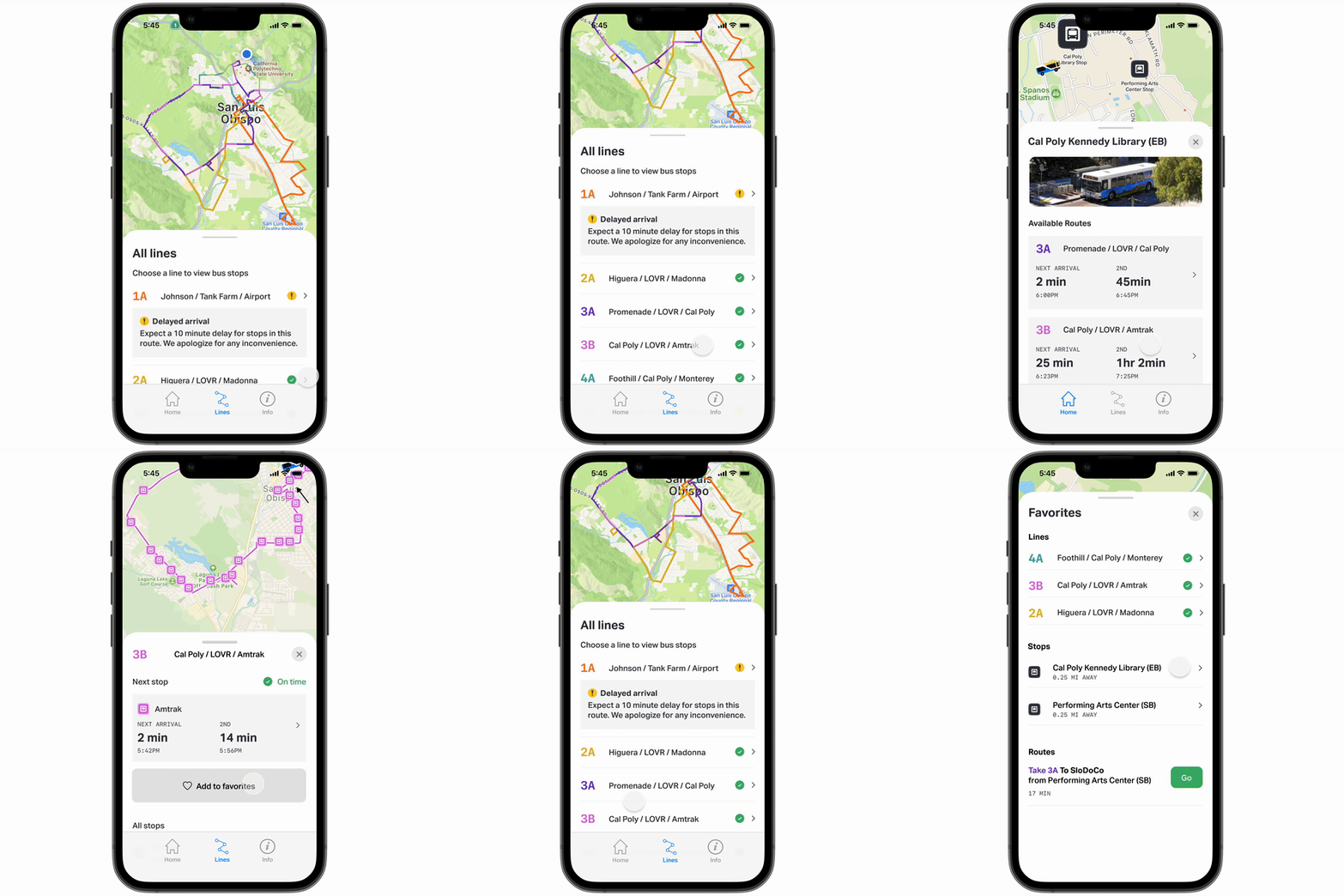
For frequent SLO Transit users, easy access to favorite bus stops and lines is important for daily use. Individual stops and lines can now be added to the Favorites panel on the Home page.
Improved lines section
Stay informed on on route delays and upcoming arrivals
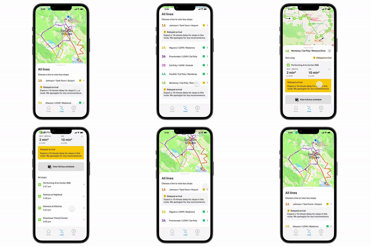
Our improved layout clearly outlines which lines are functional and when the bus will arrive at each stop. When viewing a specific line, the first and second arrivals are highlighted for easy access, as well as a map view of each stop on the route.
Trip planning
Get to a specific destination confidently
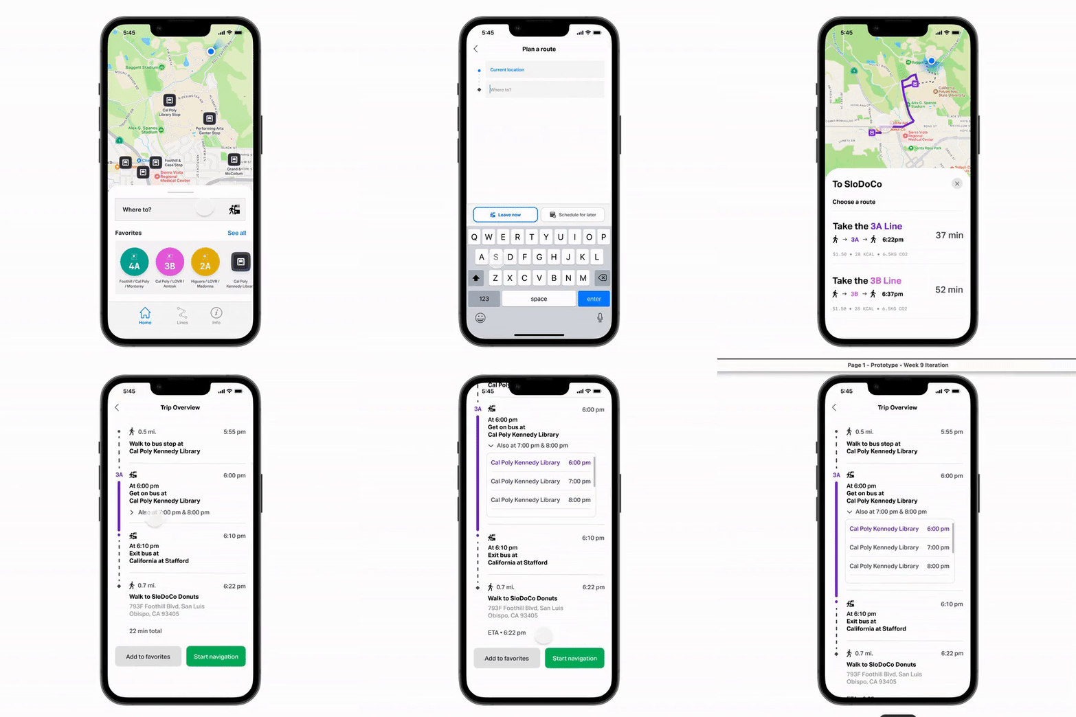
Users can plan trips to specific local destinations, whether they want to leave now or schedule their trip for a later time. The app will suggest which lines to take and includes bus fares, calories burned during walking routes, and the amount of CO2 that would be emitted by using the bus. Users can choose to save a step-by-step overview of the route or be guided with live directions.
Live step-by-step directions
Provides transit-specific guidance to local destinations
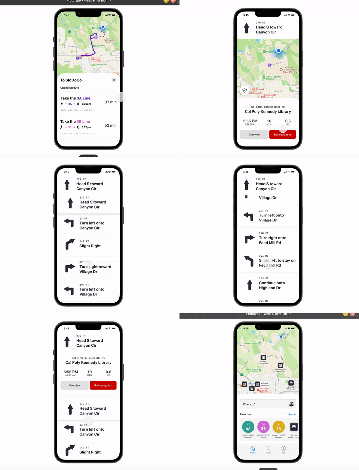
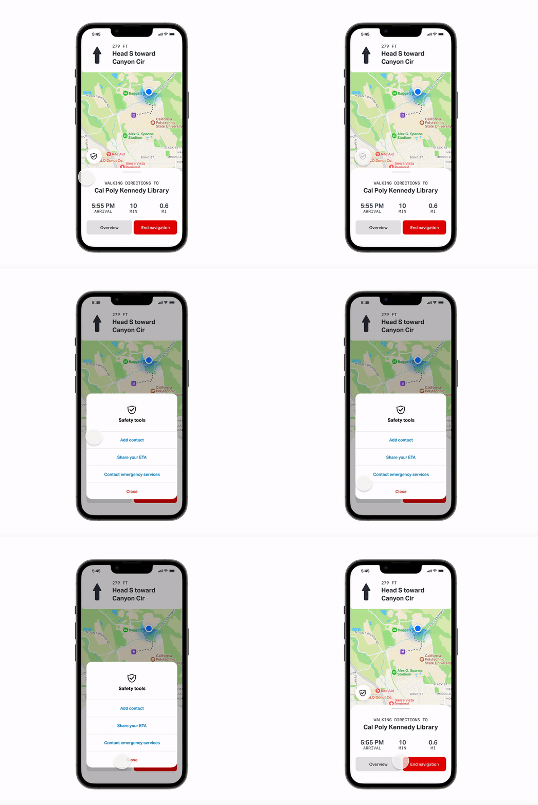
To get to a specific destination, the app provides specific guidance on bus procedures (such as walking directions, getting off specific bus stops) and access to information on bus arrival times, live.
Safety tools
Access important tools to enhance rider safety
Safety tools allow users to add emergency contacts and share their estimated time of arrival to a trusted person. This feature helps users access important safety information and comfortably ride the bus.
Challenges & Lessons Learned
-
Our work took place throughout the quarter that we returned to in-person activity, with the adjustment and pace we struggled with finding availability when our team member could meet.
-
We encountered difficulty deciding between a standard time table or live updates/ bus tracking, and maintained thoughtful discourse on which would be more desirable for users.
What’s Next
-
A collaboration with San Luis Obispo shops and stores to mirror the live updates for the bus status and arrival time so that users are able to be alerted when their bus is nearby.
-
Given more time we would lean into accessibility more by adding multiple languages and ensuring that we use colors and icons that are easily understandable.